The wait is over. It’s time to reveal the 2016 Global Talent Search Finalists, chosen from the 50 Semi-Finalists (who were selected from nearly 1,000 artists’ work).
We are thrilled to unveil the SIX Finalists, knowing that one of these artists’ careers is about to change forever.
Five were chosen by our panel of industry experts, and one chosen via public vote (our peoples choice winner). The overall competition winner will be represented by Lilla Rogers Studio for two years, and win a host of licensing deals from prestigious companies (see here for the awesome prize details). The second assignment Lilla created was full of possibilities! The Semi-Finalists were asked to design a cover of a dessert recipe book from Sunny’s Cafe.
So without further ado, here we go…
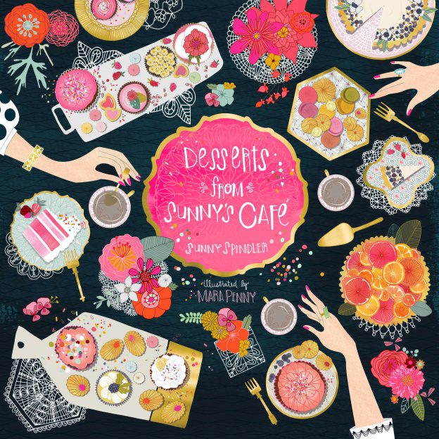
Over 10,000 votes were cast by the public, and we can now reveal that the 2016 Global Talent Search People’s Choice Finalist is:
Not only was Mara’s piece chosen through the public vote, she is also the top choice from our judges!
Comments from the judges:
“Mara Penny has full comprehension of the assignment. The feeling is delicate and feminine…like dessert! Nice contrast of color…inviting! Beautiful technique…love the lace doilies.”
“Mara Penny: Her composition, use of both arms and objects, and her palette all appealed to me. She created a bold book cover with quite a bit of detail as well. I’d pick this book up and hold it in my hands in a bookstore. Pretty work!”
“Mara Penny’s piece is eye grabbing! It is a complex illustration with lots of elements and the detail is wonderful — look at the tray of orange slices! Yet she lays the piece out in such a way that the piece feels clean and not too crowded.”
***

Our stellar panel of judges – with more than a century of industry experience between them in the Gift, Home Décor, Editorial and children’s book illustration, Fabric and Stationery, markets – took days deliberating over the Semi-Final gallery. It was incredibly hard to choose, but in the end the following five were selected as the other Finalists (in no particular order). Below each submission is a comment from the Judges on what stood out in the piece.
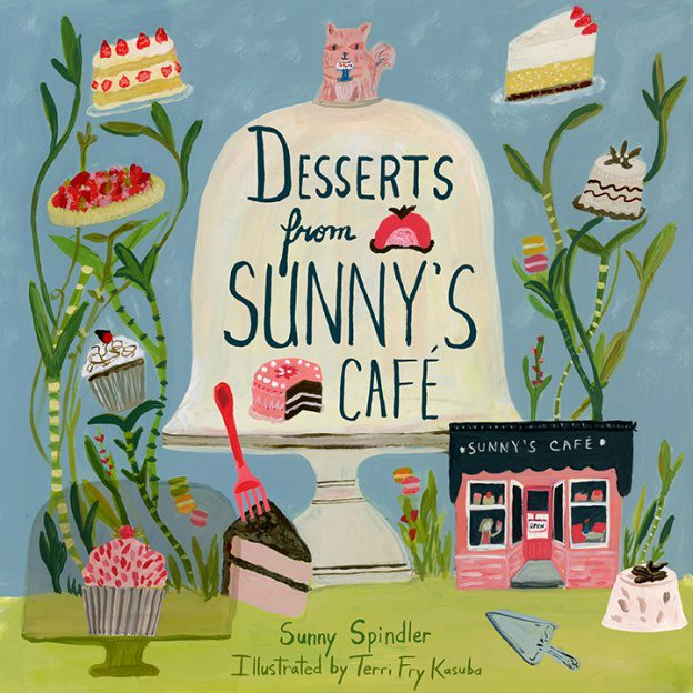
Comment from the judges:
- Combines desserts with elements of nature and gardening.
- This is a magical place where the cake grows in plants and I love that sense of whimsy.
- Love the painterly style. Her work seems to have great editorial potential.”
***
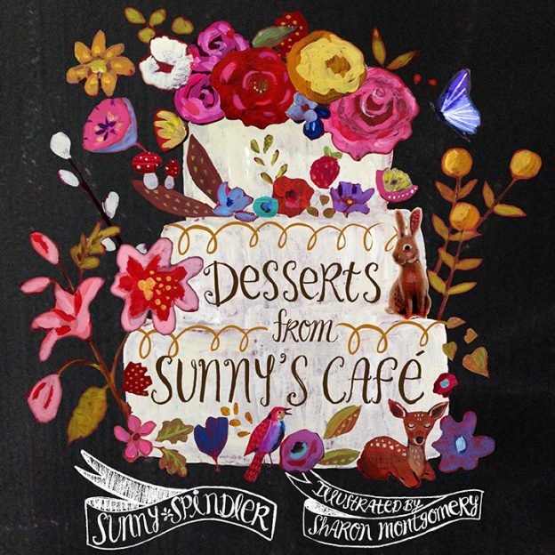
Comments from the judges:
- Her hand-painted, textural work stands out from the crowd and screams, “I AM PREMIUM.
- This is a beautiful cover and a gorgeous work of art as a standalone.
- Her daring black background. Her animals and flowers are nicely worked into the cake’s base and border.”
***
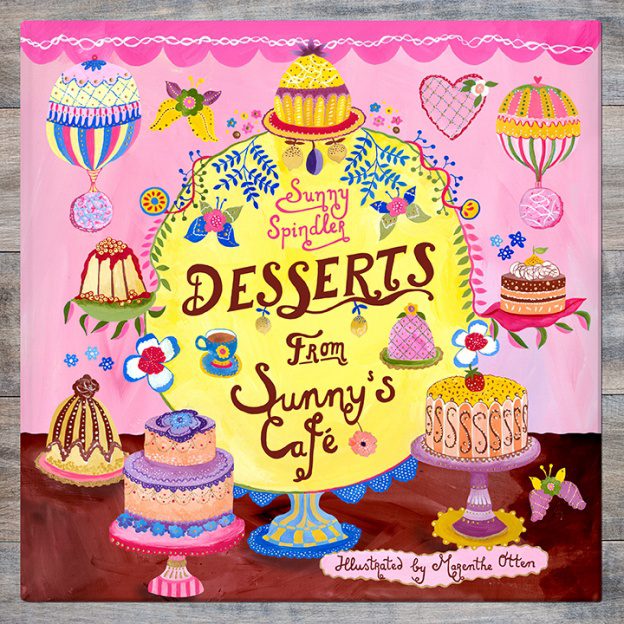
Comments from the judges:
- This entire design is “pretty” and very sweet!
- Nice composition and central focal point
- Varied cake designs
***
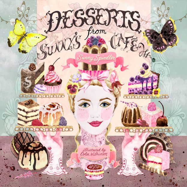
Comments from the judges:
- Highly detailed with so much happening in the piece yet it feels clean not too busy
- Has a bit of “Marie Antoinette” flavor….the marketplace can’t get enough of Paris!
- Nice technique and color – playful and sophisticated.”
***
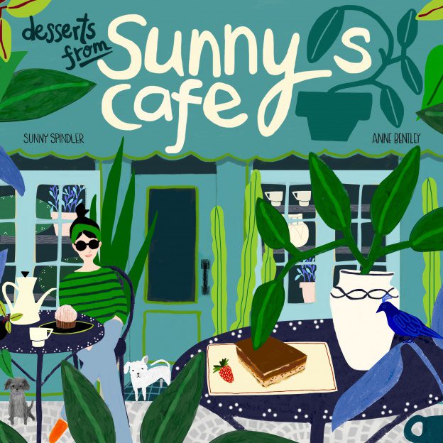
Comments from the judges:
- Really stood out as being different from the rest.
- Her color choice was bold and her style of illustration is very interesting.
- Her style is editorial but could be adapted for products as well.
***
Lilla’s comments about the Finalists
- First, they utilized extra bold contrast in their pieces and the work is easy to ‘read’. That is, you can distinguish what the imagery is at a glance. (Work that is too soft, or lacks contrast tends to not grab the eye of the art director, even if it is a beautiful piece.)
- Second, you will see that the color palettes are totally gorgeous. On some level, this is probably one of the strongest reasons a piece gets selected. I know for me this is huge.
- Third, the space is fully filled, but not in a cluttered way. There aren’t lonely spaces. This doesn’t mean that the piece needs to be filled to the brim, but there needs to be plenty of imagery in the piece. There are little things to discover upon further study. To create a pleasing piece without looking disorganized requires thoughtful design of the page.
- Fourth, interestingly, all the typography is hand-lettered. The artists didn’t use type fonts. The judges respond to hand lettering on a gut level.
- Fifth, and this one surprised me: five of the six pieces have a very large central focus! Perhaps that is pleasing to the judges, especially for a book cover. It gives the cover a sense of authority.
***
The judges also answered two important questions for us:
In general what stood out to you about the artists you chose?
- All focused on the desserts, instead of the author of the cookbook. I found this appealing because it actually made me hungry and want something sweet!
- These artists also had designs that would stand out on a shelf.
- Many of them used dark backgrounds which really made their design elements stand out.
- I love bright colors and they definitely had the brightest, strongest colors of the bunch!
- All felt original and fresh–they stood out amongst the others as being inventive, thoughtful and well-rounded as illustrators.
- Each of them possess a high level of design skills that shone through in their pieces.
- Bold use of color and color contrast.
- Really liked the use of an unexpected dark background color. Sense of depth in the scene or interesting point of view.”
- Several of them have an artists approach rather than a graphic designers approach which I think is appealing in today’s market.
- They all look handmade or handpainted which is desirable. They also had a sense of humor in their work. People want to smile so this is important.
- Each of them has commercial potential in either the editorial or gift/stationery market, or both.
- Sophistication in their technique. A consistent style throughout the portfolio.
- Commercial appeal to the imagery.
What advice would you give to those who you did NOT choose, in order to make their work more commercially appealing?
“Develop a voice and look that’s your own. Stay on top of how your work stands up against others in the market. Do your research by absorbing a bit of reference each day and stretch your muscles by working on self-assigned projects that keep your work pertinent (take inspiration from all the MATS assignments!!). Most important: have fun with the art that you make so your personality shines through!! Approach every project, big or small, with a sense of adventure and conquer your creative challenges with spirit, flavor and style! “
“Book jackets need to be a clear read. There needs to be a strong focus, and clear legible lettering. Simplify it down and avoid being formulaic.”
“Human characters are really tough! Art directors and buyers tend to have a really particular point of view and it can make or break a commission or purchase. In my experience, the US commercial market is less open to funky/exaggerated illustrative perspectives on humans (compared to the European market or other international markets). Color contrast, dynamic composition, and a clear focal point are very important to make a product, book cover, etc. stand out from the crowd.”
“Make sure your style has a unique voice. It should be somewhat timeless. If you include people in your illustration make sure your audience can relate to them. Don’t make your drawing too childlike unless that is your audience. Know what demographic you are targeting. Have a sense of humor in your work. Everyone likes to smile. “
A closing note from Lilla:
Congratulations to everyone! We are thrilled that together 10,000 public votes, plus our judging panel comprising some of the top art directors and creative professionals in the industry, independently selected a set of Finalists where many are graduates of Make Art That Sells. It’s clear that the courses helped them develop commercially-viable art, choose amazing colors and present it professionally. We cannot wait to see the work that comes out of our brand new class “Illustrating Children’s Books” which begins on Monday October, 3, 2016.
Stay tuned for the third and final assignment and thanks to everyone for voting!
xo,
Lilla, Beth, and the Studio Ladies
***
Would you like to Make Art That Sells?
We have the following courses currently open for registration HERE!
Do you dream of illustrating a children’s book? Would you love to create a magical world with characters that you’ve designed? Do you love the magic of children’s books and feel that you have something to offer? Then this course is for you.
In five weeks, you’ll create a brilliant children’s book pitch to help you land your dream children’s book gig. You’ll get over 20 videos, weekly assignments, live weekly video reviews, interviews with publishers and illustrators and more. Co-taught by top art agent Lilla Rogers and highly-respected children’s book art director Zoe Tucker.
Spaces are limited for our first session of class this October. Don’t miss out. REGISTER HERE
***


