Lilla here. I can’t wait for my brand new course, Color Quest, which starts in just a few days, on Monday, February 3rd. I’m excited to see what you do with the assignments I’ve written for you and what they do to the way you use color – I know that my use of color has evolved and grown just from writing the course and trying it out for you, and I think it’s going to have some astonishing effects on the art that you create.
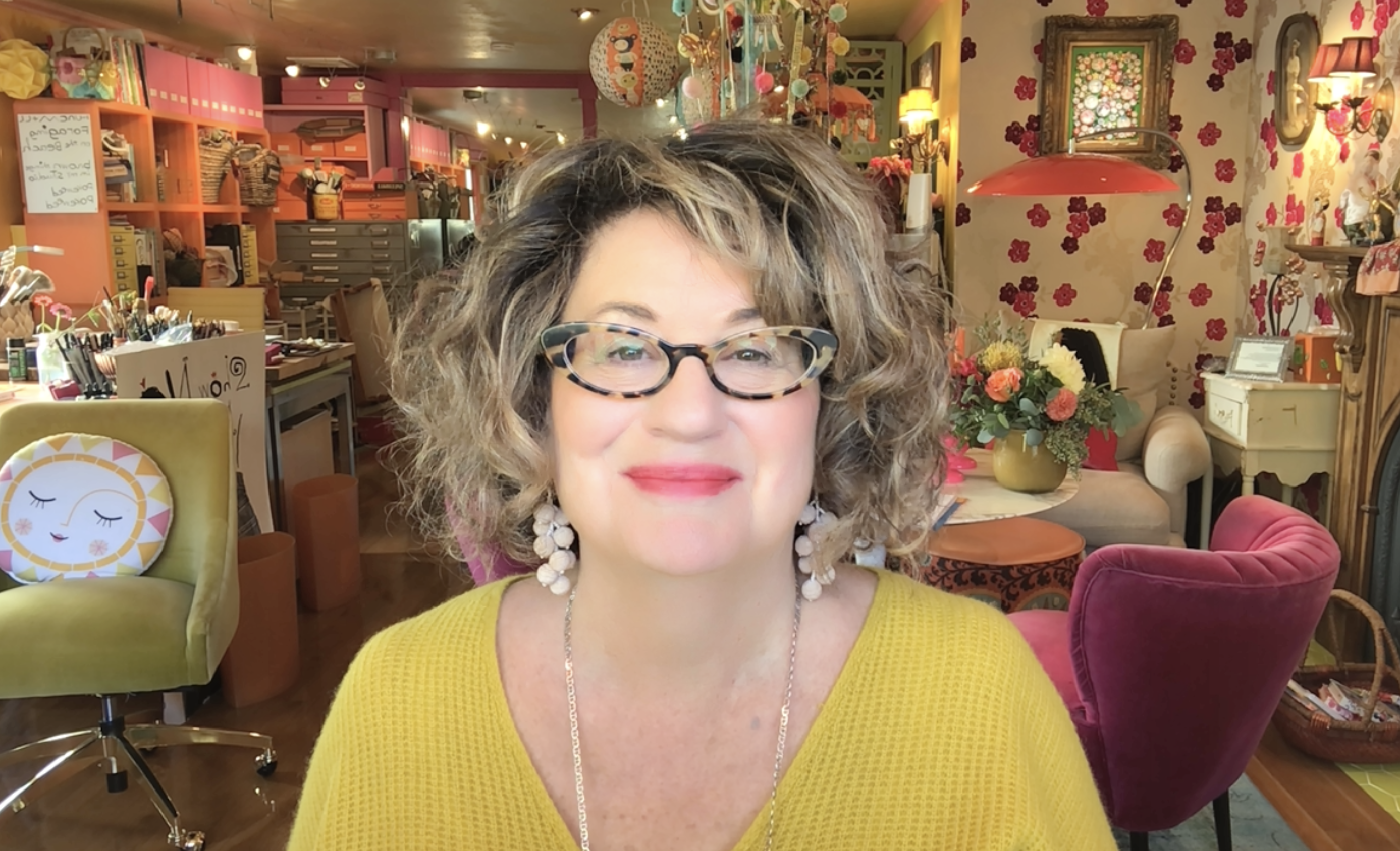
Lilla here! I can’t wait for you to join me in my brand new Color Quest course, which starts THIS MONDAY, February 3rd. P.S. Can you tell I love hot pink and chartreuse?
Today I’m sharing a #MATSprep warm up exercise that I’ve created for you to help you get ready for class.
Your Assignment
Here’s your assignment to get you thinking about color, and how it can affect mood and tone. Let’s get started!
Let’s say you just received a lovely email from a card company that would like you to do some Valentine/friendship cards. They would like a sophisticated palette, and they’ve asked you to not use bright red as they want a line of cards for Valentine’s Day that has a soft and elegant feel.
The first thing you’d need to do, before you make your illustration, is to come up with your color story.
Q. Lilla, what’s a color story?
A. The color story is the palette of colors that you’ll use for your art, and it will have a massive influence on the vibe of your finished art work.
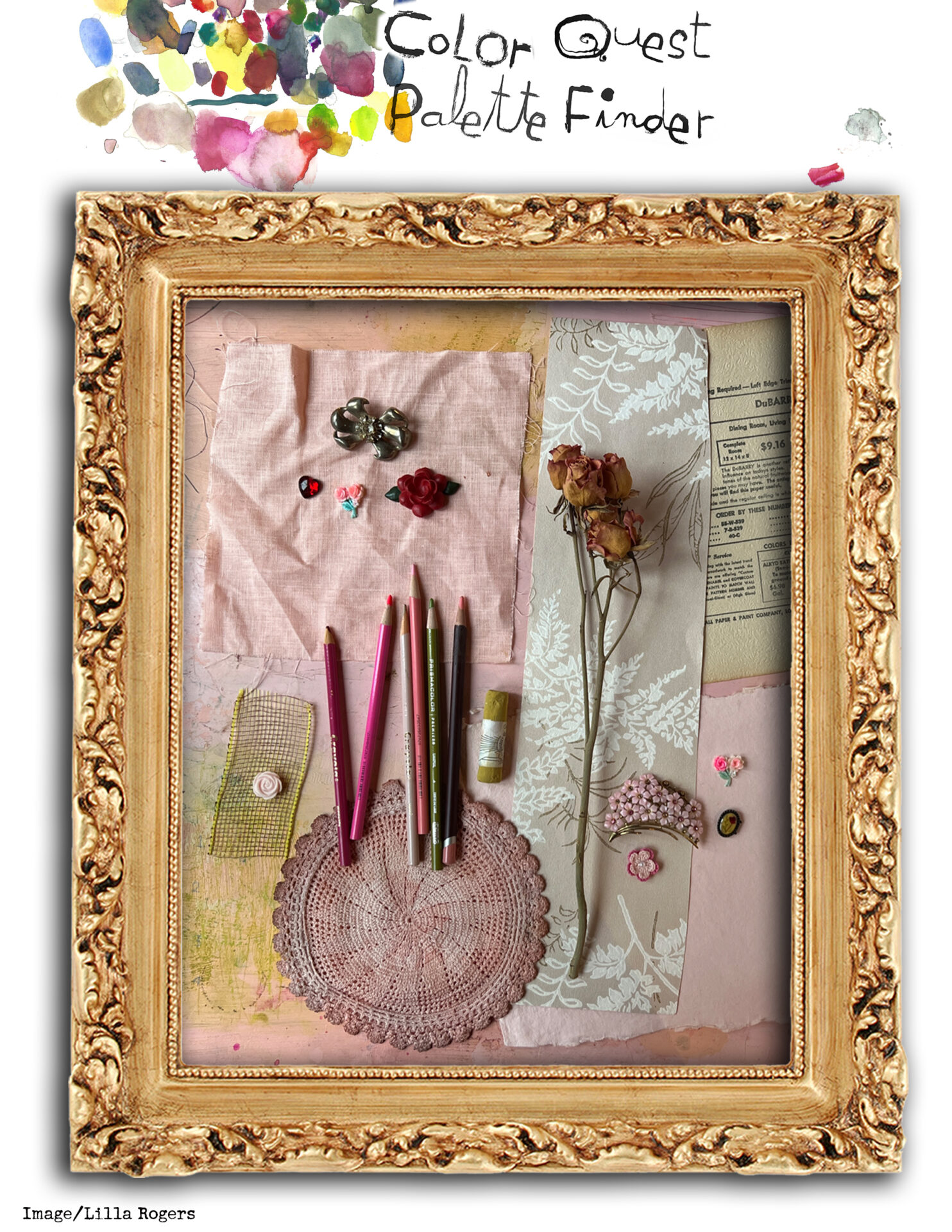
Here’s the flatlay color palette I’ve made for you.
Here’s your Palette Finder! Download your copy here if you like. Let’s explore its color story together.
Just like last week’s prep, I want you to try to match the colors in the image above. Make watercolor or gouache blobs on your watercolor paper for your colors, matching the size of your blobs to how much of the color there is in the image: big blobs if there’s a lot of a particular color, smaller blobs if there’s just a little bit.
Just like last week, don’t worry if you can’t match the colors exactly, just get as close as you can. And, just like before, you can work digitally if you prefer.
1. So, let’s dive in! Looking at the flatlay image, what is your first impression of the color story here? What adjectives come to mind? Soft, gentle, pale? That will help guide you.
2. Next, if you were to sum up one main color in the flatlay image, what would it be? I think it’s the soft pink as you find in the background fabric, doily, paper and floral jewelry pin. So, you could either make that blob large, or you might even add several blobs of the pink shades and tints that you see in the photo.
For example, look at the wrinkles on the fabric on the upper left to discover lighter and darker variants of the pink. To make lighter variants, add white. To make darker variants, try adding just a tiny bit of the complement of pink, which is green.

You’ll get four of these Palette Finder downloads every week of the course to help you create brand new color stories which will grow your art and make it even more gorgeous. Sign up here.
As I mentioned above, you may not be able to make exact matches of the colors you see in the photograph. Why? That’s because pigments can’t do everything. They have limitations. It does help you to have a variety of paints including a few of each primary and secondary color (red, yellow, blue, and orange, green, violet) plus white. It’s not a big deal if you don’t get exactly what you see. Give it a try. You’ll learn more about mixing colors in the course on Mondays and in the weekly Friday live demonstrations.
Now back to the assignment
3. Next, let’s look at the second main color. I see soft greens in the wallpaper, the pastel, some marks on the lower left, and that net fabric. I also see a bit of orange on the top center of the photo. Now, make some blobs of these colors on your paper.
4. Finally, you can add little bits of the pops of other colors, like the little bobs and colored pencils. Be sure to keep these small so that you retain the prominence of the pink on your blob page.
5. Step back and see if your blob page matches the vibe of the photo. Please know that there is not ONE way to do this; you are not a robot. You are vibing out the colors in the quantities that feel right. The purpose is to get a flavor for the palette, and hopefully, create some new color palettes.
Good job! I hope you enjoyed your assignment!
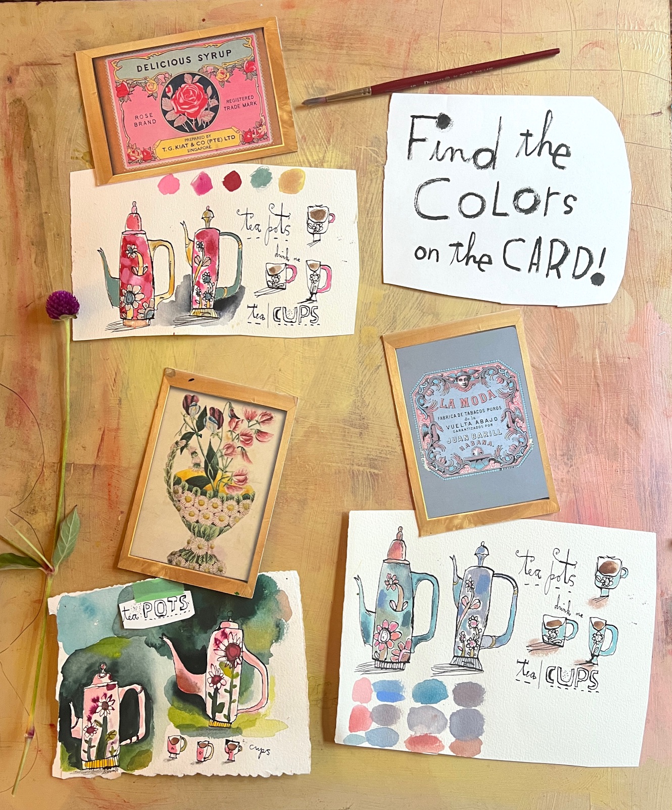
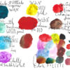
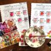
Some of my palettes from writing and trying out Color Quest. I found that it helped me evolve and grow my use of color despite my decades of experience as an illustrator and art agent!
Let me tell you a little more about Color Quest. You’re going to make twelve very different color stories from flatlay photos I’ve made for you. I’ve spent hours carefully handpicking some palettes you’re going to love, including vintage packages, from street scenes in Paris and New York, and much more!
Plus I’ve just added four more BONUS assignments just like this one, with a pretend commission for you to work to.
Two exciting things happen from these daily exercises.
Firstly, you’ll be challenged to use colors you might usually steer clear of. You’ll find yourself discovering colors that you’re pretty excited about. As part of creating the course, I actually did several of the Palette Finder downloads which got me to use colors I rarely use!
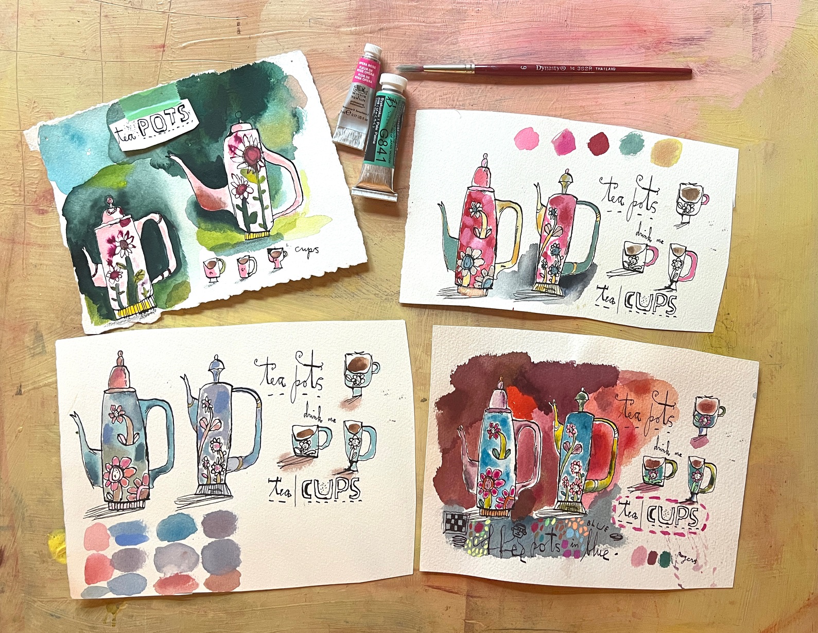
I used some of the color stories I found in my Palette Finder images to re-color the same image in several different ways, and you’ll do the same thing in class to create four dreamy pieces of portfolio art. Join now.
Second, we all tend to use the same colors or palettes. Do you have art in a variety of color vibes such as moody and dark, pastel and faded, vibrant and showy, for example? Showing a variety like this will help you get more paid jobs.
I know that if I’m left to my own devices, I will use either every single color I love all in one piece, or hot pink and chartreuse! Of course, when I was a full-time illustrator, I did need to vibe off the brief, varying the color palette for each particular illustration gig.
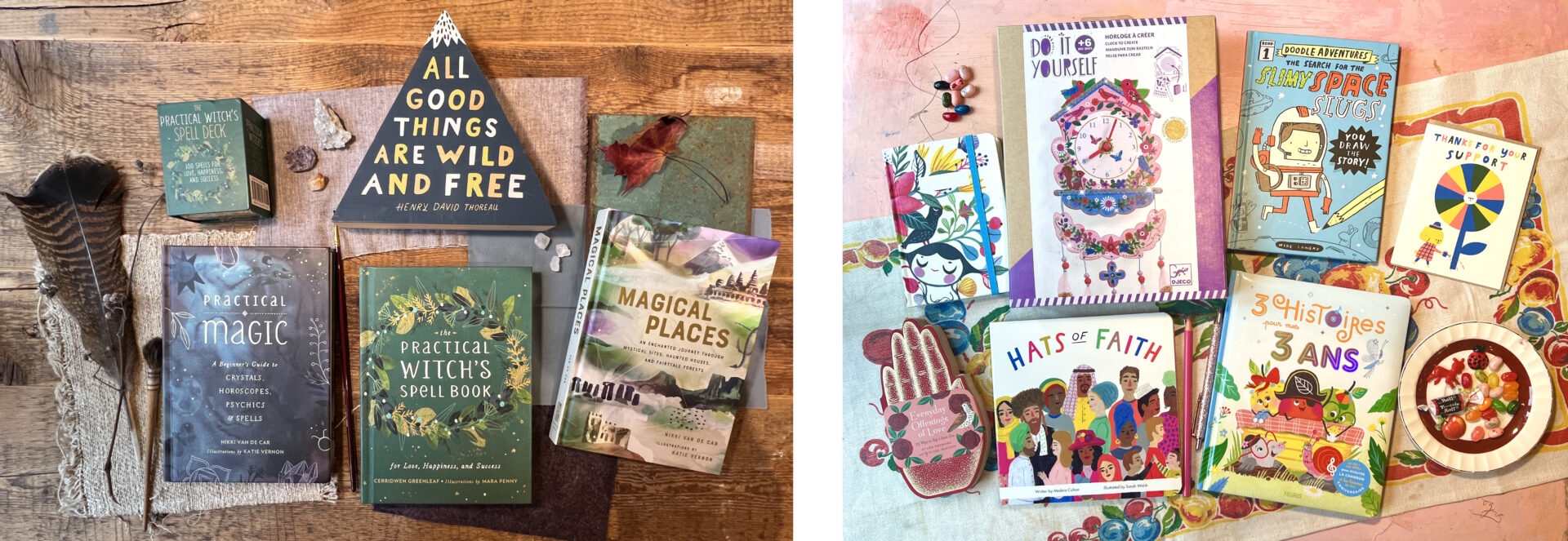
Some beautiful products agented by my art agency, Lilla Rogers Studio, in two different color schemes: dark and moody on the left, bright and vibrant on the right. Do you see how showing work in a variety of palettes can help you get more jobs in more art markets?
Working the daily Palette Finders in class will increase your range so that a) your art looks even better, b) you’re having more fun, and c) if you’re a professional illustrator, you’ll get more work. I can’t wait to see what you do.
And don’t forget the weekly LIVE demos in class! This course is going to be a blast!
Class starts THIS MONDAY, February 3rd! Join me!

- THIS MONDAY, February 3rd: The long-awaited start of my Color Quest course! Up your color game, make eye-catching art for your portfolio, and create dreamy palettes that you’ll love to use. Don’t miss it – find out more and sign up here.
- Next newsletter: Join me for a FREE live Zoom event to celebrate the first day of Color Quest on Monday, February 3rd at 12 noon ET/5 pm GMT! Mark your calendar now!
Lots of love

P.S. Don’t miss the FREE Zoom with me on Monday at 12 noon ET/5 pm GMT! I’ll be giving away a FREE place in class, popping up a volunteer on screen for live 1:1 mentoring, answering your questions and more! You’ll find the link to join the Zoom in Monday’s newsletter, in our Instagram and Facebook Stories, and on the front page of our website at makeartthatsells.com


