
Today we’re sharing a fabulous FREE class on composition from illustrator and former art agent Lilla, to help you become a composition master!
As an educator, Lilla has taught everyone from little kids to professional artists, but one thing remains constant: she breaks down complex ideas in a way that makes it whimsical and fun, and accessible for everyone. Or as Lilla says, “I trick you into doing your best work.” Just check out this lovely composition class to see what we mean.
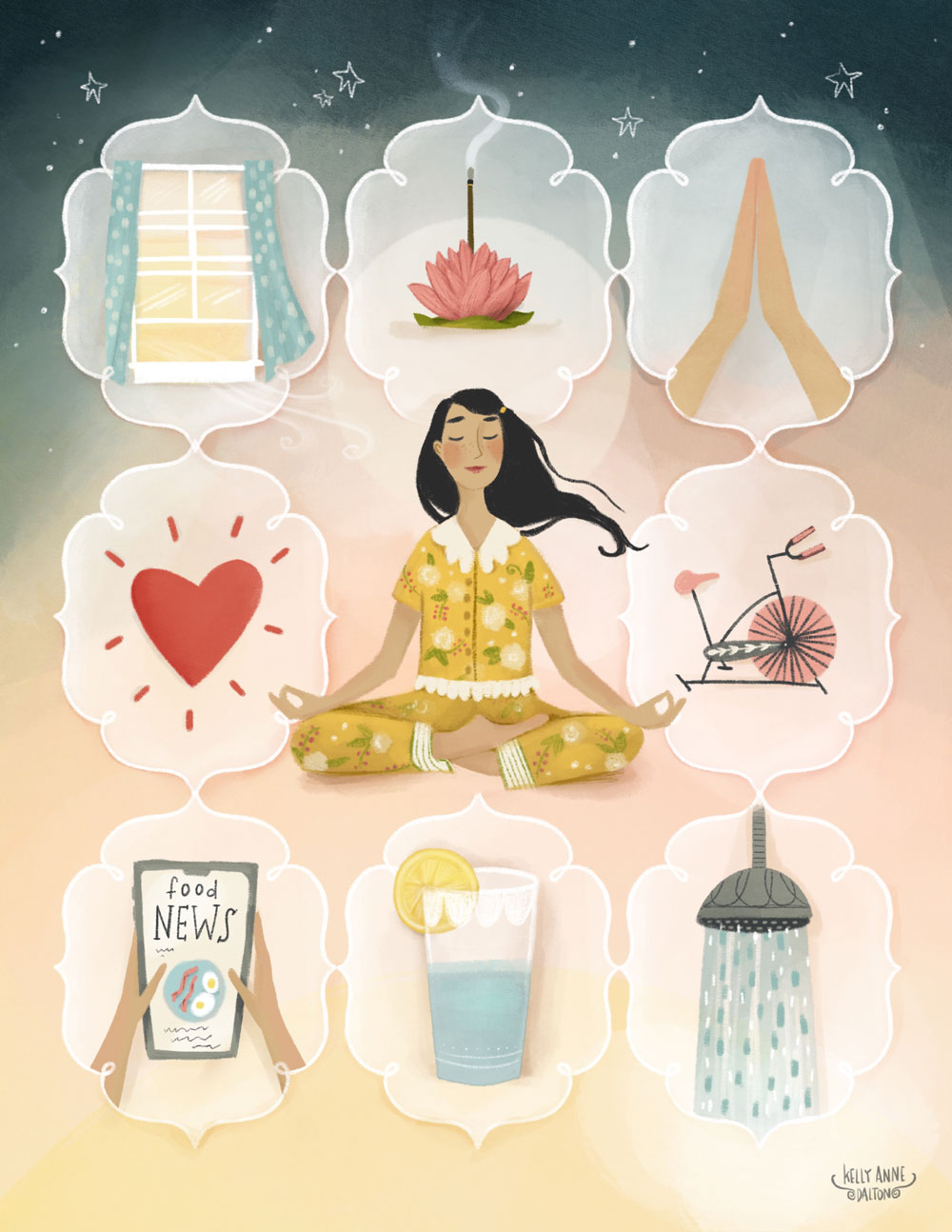
Art for Editorial: Illustrating for Magazines & More by Make Art That Sells student Kelly Anne Dalton.
Kickass composition by Lilla Rogers
Lilla here. Years and years of illustrating full time taught me ways to design a page, and now I’ll share them with you. I’ve gathered some flora from a bucolic country garden in Western Massachusetts to show you some of my own favorite composition layouts.
How your artwork is composed is so important! I’ve seen really great imagery passed on by art directors because the overall layout is not as strong as it could be. Don’t let that happen to you!
Perhaps you’ve taken Creating Collections for Home Décor and you want to present your product ideas in a striking page. Maybe you’re making fabric patterns or a magazine illustration, and you want the items that you’ve drawn to make a beautifully designed page. There are a million ways to compose a page. Some of you like making a calm and quiet piece of art and some of you love a massively full page. What is your busy-ness quotient?
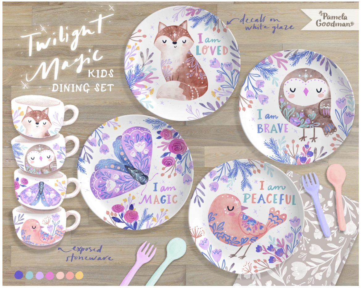
Art for Creating Collections for Home Décor by Make Art That Sells student Pamela Goodman. Good composition is essential for making your art appealing to art directors and creative directors.
Today, you’ll explore this, and look at six compositional layouts, before making a composition using random items you find.
Composition Style #1: Big/Little Layout
Vary scale. Show one really, really big thing and then a few little things.
Let’s look at a terrific compositional layout I call Big/Little. Here’s a really big grape leaf and then bits of other things that are much smaller. The little bits can be lined up vertically on an invisible grid, like so:
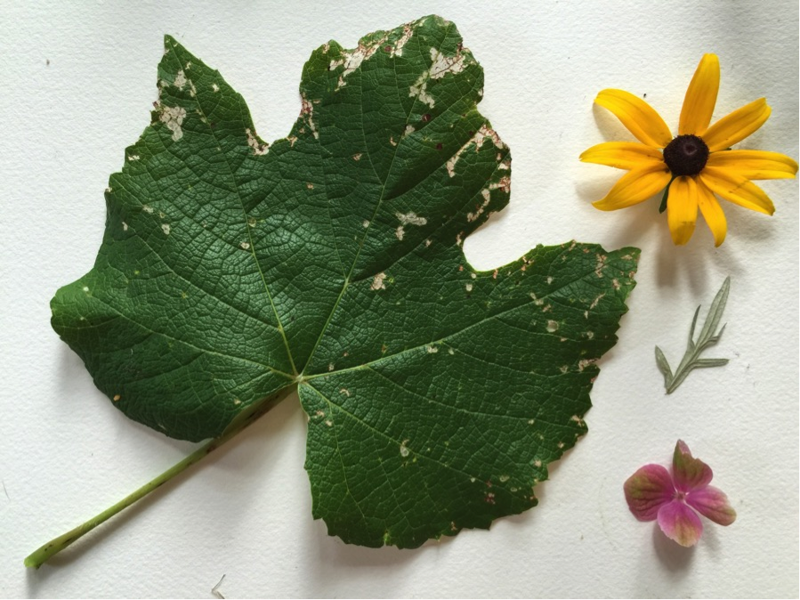
Notice how everything fills the rectangle nicely. Even the stem of the big grape leaf plays a role.
Very often, I notice that artists are afraid to draw something huge on the page. Everything is the same size, and sometimes that makes the artwork less dynamic than it could be. So think about showing a BIG thing. It adds instant drama.
Let’s do Big/Little yet another way.
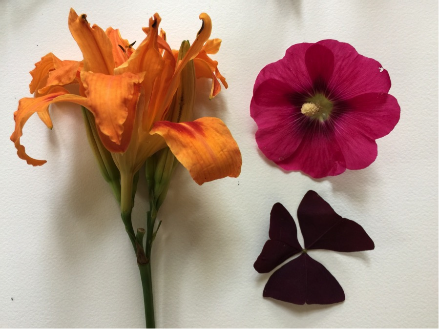
Again, we’ve got a really big item—the orange day lily—and then smaller items that are placed on the right, lined up vertically.
Here’s another Big/Little:
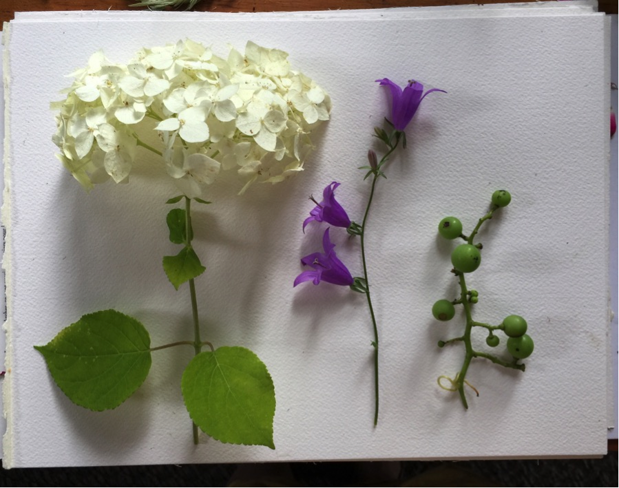
This time I haven’t lined up the small items vertically on the right. They aren’t round and small like the ones above; they are verticals. The big white hydrangea bloom is a strong horizontal which balances out all the verticals. Isn’t composition amazing? It’s such a puzzle to solve.
Composition Style #2: Lush with Borders Layout
In this example, I’ve used the composition I showed you first (with that grape leaf), and then filled the page to the brim. I’ve then used long stems, vines, and branches to make an informal border.
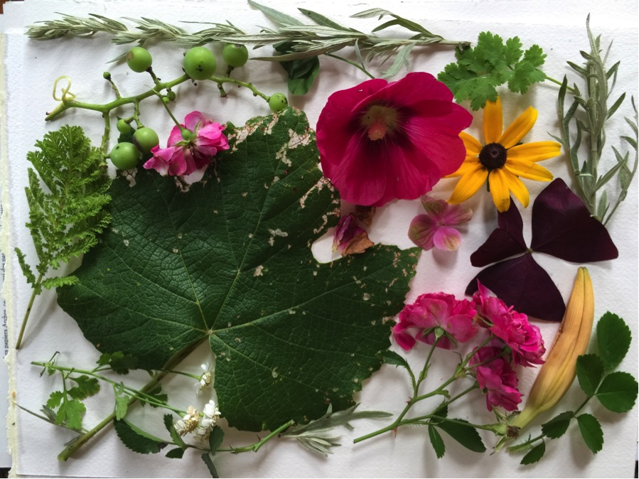
Do you love a really full, busy page? Is too much never enough? Is lush your middle name? Then the above is for you.
Composition Style #3: Big and Thin Layout
Here’s a variation on the Big/Little composition format. I call it Big and Thin. I’ve tipped the big False Solomon Seal at an angle.
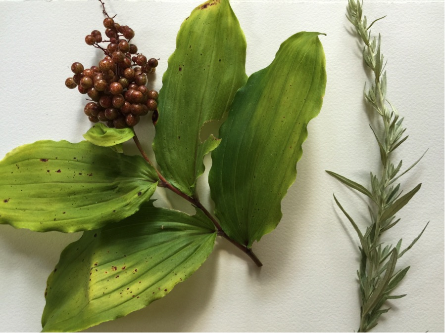
Here’s another example of Big and Thin going in another direction. It’s very much about lining the items up on an invisible grid. You graphic designers out there know what I’m talking about. This should be an easy game for you.
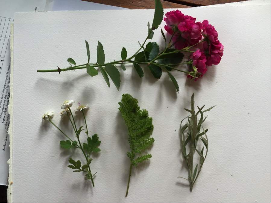
Composition Style #4: Symmetry
A classic favorite is Symmetry. It’s easy and fun to do. You can make such beauty on a page with a calming, structured, and balanced symmetrical design.
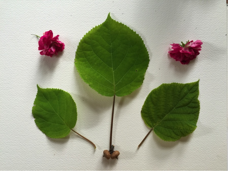
I like the little nuts at the bottom. A bit of wit.
Composition Style #5: Triangle Symmetry
Now, let’s do a semi-symmetrical variation. Here, I’ve made a pyramid for you. There’s a very tall item in the middle, and then the items get shorter as they go outward to the sides. It’s a kind of symmetry—not identical on each side, but still.
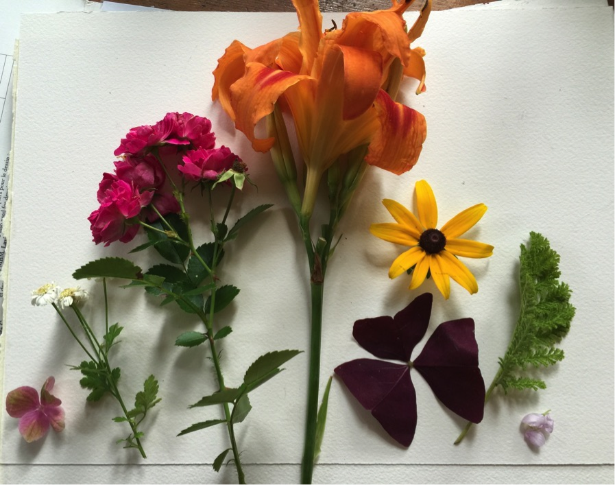
Here’s another Triangle Symmetry:
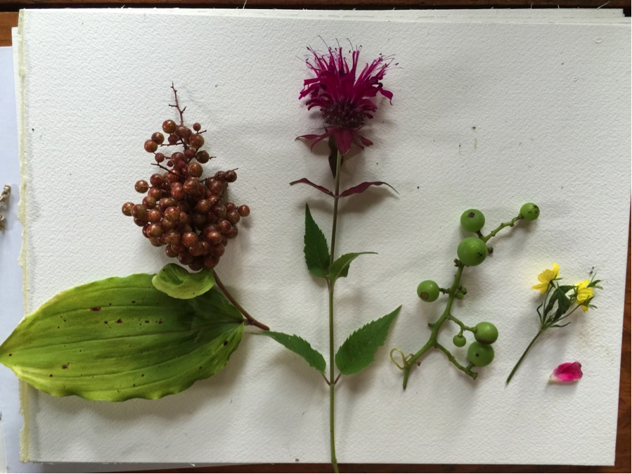
In case you’re interested, (from left to right) that’s False Solomon Seal, bee balm, grapes, I don’t know, and a tiny rose petal.
Composition Style #6: Mosaic
Those of you that have taken my class know that I refer to an all-over design as a mosaic. It’s got spaces in between and stuff is every-which-way. It’s not easy to do well. Do remember to vary the sizes and shapes of your items. Try for verticals, horizontals, and diagonals; not just round stuff.
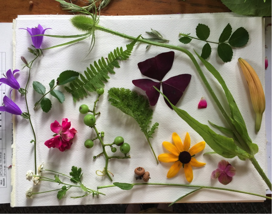
I’ve never really found anywhere that teaches composition the way I wanted to see it, so that’s why I wanted to give you concrete examples.
Composition and design are hard! I hope that this has helped you to take some challenging concepts and start to understand them in a concrete way, and to add ammo to your tool kit. These are my made-up terms, by the way!
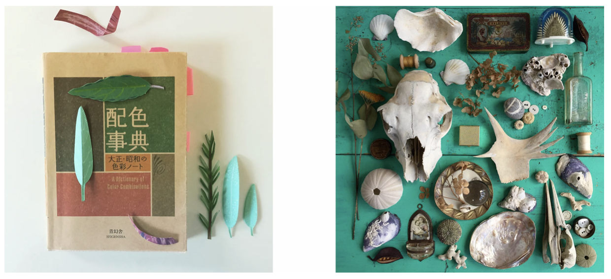
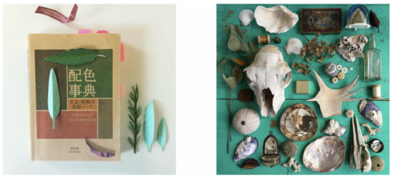
Compositions by Trish Phillips (left) and Maria Over (right). Check out #MATScomposition on Instagram to see more!
FREE assignment!
So now it’s your turn. You can dump out your bag, pocket, diaper bag, junk drawer, shell collection, or whatever. Then, make a well-balanced composition and share it with us. Do you like serene and minimal, or are you a maximalist? What pleases you in the laying out of objects? As always, there are no rules, so have fun. When you’re done, share it on Instagram with the tag #MATScomposition so I can see!

We hope you enjoyed the lesson! If you want more of Lilla’s whimsical teaching style, be sure to check out her wonderful self-paced courses here!
Lots of love
The Make Art That Sells team xxx